ShopDreamUp AI ArtDreamUp
Deviation Actions
Description
Entry for =ceciliay's Blue contest [link]
EDIT: I cut a little of the top and the sides... Hope it looks a little better now
Stock:
~Liasmani - [link]
~mimose-stock - [link]
=CSnyder - [link]
~dawn-at-the-lake - [link]
`hameed - [link]
~Hrivalasse-stock - [link]
`budgie - [link]
sxc.hu - [link]


Featured here: [link] by =Emerald-Depths
Featured here: [link] by =euphoricdesire
Featured here: [link] by =Emerald-Depths
Featured here: [link] by =ceciliay
Featured here: [link] by *arbaxa
Featured here: [link] by *Illuzie
EDIT: I cut a little of the top and the sides... Hope it looks a little better now
Stock:
~Liasmani - [link]
~mimose-stock - [link]
=CSnyder - [link]
~dawn-at-the-lake - [link]
`hameed - [link]
~Hrivalasse-stock - [link]
`budgie - [link]
sxc.hu - [link]

Featured here: [link] by =Emerald-Depths
Featured here: [link] by =euphoricdesire
Featured here: [link] by =Emerald-Depths
Featured here: [link] by =ceciliay
Featured here: [link] by *arbaxa
Featured here: [link] by *Illuzie
Image size
700x1144px 726.83 KB
© 2010 - 2024 Djsanka
Comments51
Join the community to add your comment. Already a deviant? Log In
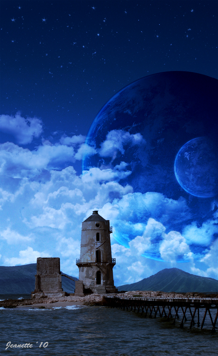
The first thing that I like about this manipulation is the fact that the lighthouse has the same tones as the sky, which makes it look like a unique shot. Then, the two planets give it more surrealism.
The things that I would try to improve would be...
1. The water - it looks like it has no reflection on it - As you gave that cool look to the lighthouse, you should have given it to the water aswell(in my oppinion). But anyway, what I like about the water is the fact that´s not as bright as it was in the original image, which is good.
2. It has a lot of empty space on the upper part. The gradient is good, It really gives intensity to the image, but I feel like something is missing up there. Maybe you could have cropped it closer to the lighthouse, where is the top of the planet.
Hope this helps <img src="e.deviantart.net/emoticons/s/s…" width="15" height="15" alt="


